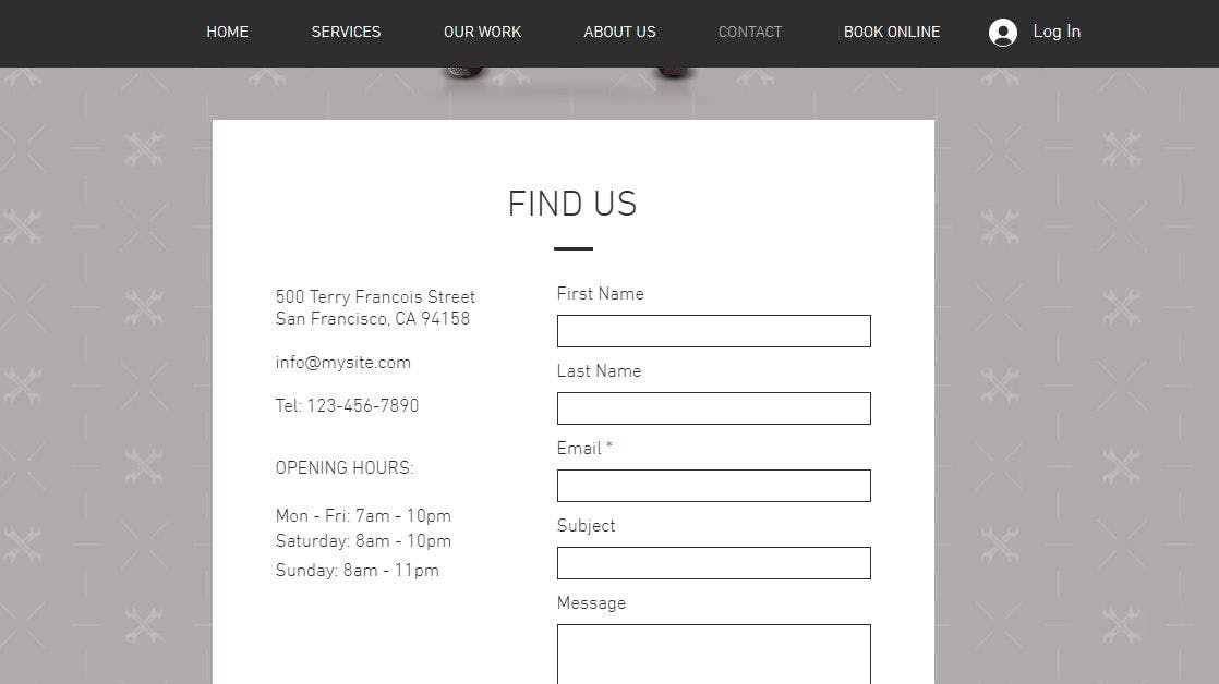
Creating a contact form with Velo is easy as pie! Wix’s website templates give an absolutely usable and extremely competent contact form. However, it only offers rather simple text boxes for submissions and a black and white or a simply coloured scheme. You can of course change that, but I decided to stick with it as it’s both simple and easy to use for the end user.
The first thing you'll want to do is change your street address to your business address or delivery center (This is useful if you accept physical mail). Also, you'll have to edit your email to the business inquiry email of your business, the telephone number to your businesses landline or phone number.
Then, replace the opening hours with your own (Pre-Covid I would assume) opening hours, and after you have finished with that it’s just a matter of filling in where the user's submission is sent. Now you can finally change the email notifications to your own email, or your business one if that is your fancy.
Otherwise if you do not wish to use your personal email for it then you have the option of leaving it blank and it will automatically send submissions to the website contributor's email, provided it’s not just you on the contributor side of your business project.
The contact form is incredibly easy to implement to your website, though to do it from scratch is just a rather bit more complicated. You can then insert a section with the add menu, as can you add text boxes.
To turn all your contact form junk from the add menu to a functioning contact form for your business, you must link the text areas to the submit button using Velo’s built in menus. Again, it’s best to just use the preset ones given by Wix and customise it.
To create a contact form and link it to your email is easy with Wix's Velo. All you have to do, as mentioned before, is either use a Wix website template that includes it, or add it yourself under the add button. We’ll ignore going into detail to make your own as it really is a waste of time if you’re trying to use Wix. The biggest draw of the platform is no-code capabilities!
Check out the contact us form I built live-on-site here.
Final Thoughts
At the end of the day, using Wix Velo for your contact forms is recommended for those with little to no coding experience. It is an easy platform to learn, that’s a given. If you just want a basic, yet colourful form, use Wix!
Wix's Velo provides great value for a fair price of...let’s see, $0(£0 For the Brits in the audience).
It is a free platform that offers editing of even the behind-the-scenes of your site. Furthermore, it only asks for a premium account to remove branding of themselves.
I personally found this experience amazing! And an incredible opportunity for budding entrepreneurs and businesses alike.
Go to wix.com/velo to try it out for yourself! Velo is intuitive when creating simple elements like a contact us form. However, there are some issues with mobile design as things tend to span the whole mobile region, instead of utilising the space available.
This article is part of a writing contest hosted by Hacker Noon in partnership with Wix. Learn how to enter here and take a shot at winning $1000 every month, from March 1st, 2021 to May 31st, 2021.

